
Phone tattoo photography: show the work, not the filter
A useful photograph shows the whole design, preserves its colour and explains its placement. Build a simple routine for documenting your progress without disguising the result.
The photograph is part of the work
You have spent time on the drawing and how it sits on the body. Then comes the photograph: a reflected lamp, a cluttered background or an overly tight crop can make it difficult to understand. A better result does not necessarily begin with a new phone. It begins with deciding what you need to show.
If you are still learning, apply the same care to drawings and practice pieces. Keep those separate from photographs of tattoos on skin and label them clearly. An honest archive makes progress easier to see and feedback more useful.
Simplify the light first
White balance compensates for the colour of the light. Nikon explains why mixed lighting can make faithful reproduction difficult and how a neutral reference can help with adjustment. Phones do not all offer the same manual controls.
As a starting point, seek even lighting and avoid mixing it with coloured decorative lights. Take a test and compare the skin and design with what is in front of you. Moving the light or your position is often a clearer first adjustment than changing every editing control.
Three photographs, three different questions
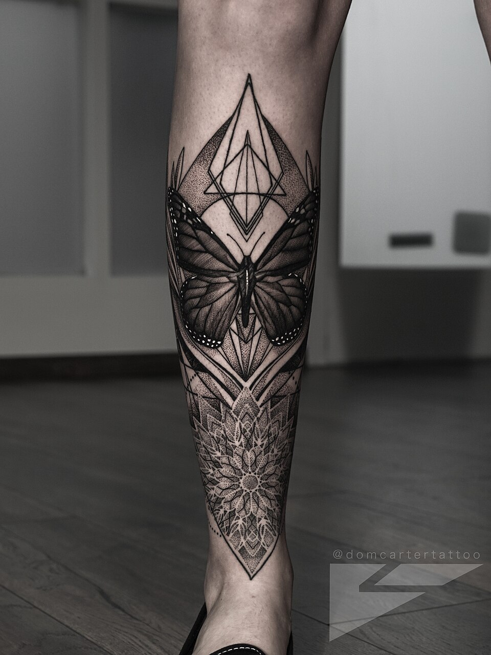
We suggest keeping an overall view, a straight-on view of the design and a detail. The first explains placement, the second makes the drawing readable, and the third highlights a specific area. A striking detail does not replace the other two.
Use a comfortable pose rather than forcing the body into a position that distorts the design. Clean the lens, check focus on the screen and leave room around the piece. Review the photograph at a larger size before publishing: a crop that looked good on the phone may have excluded something important.
A polarizer helps, but also changes the picture
Nikon describes how a polarizer can reduce reflections, affect apparent colour saturation and cut the amount of light reaching the camera. Its effect depends on the scene and its orientation. It is not a universal improvement button.
If you use one, compare a filtered and an unfiltered frame. A portfolio should explain the work clearly rather than chase the deepest possible black or the loudest colour. Keep the original file so you can revisit your decisions.
An accessory for a problem you have identified
The Fyearfly light and phone accessories are in our catalogue. They may be relevant if you want a repeatable setup; check the mount and compatibility with your phone on the product page. The example photographs in this article are not presented as results from this product.
A short routine for your archive
A consistent method makes work easier to compare over time.
- Ask permission to take the photograph and for its intended use. Keep personal information in the surroundings out of view.
- Record the date, tattoo artist and whether the tattoo is fresh or healed. Do not infer this from appearance alone.
- Save overall, straight-on and detail views with searchable filenames.
- Adjust framing and exposure carefully. Do not erase lines, reshape the tattoo or apply beauty filters.
- Keep the original and a publishing copy. Check that compression has not blurred the details.
The reference that supplies context
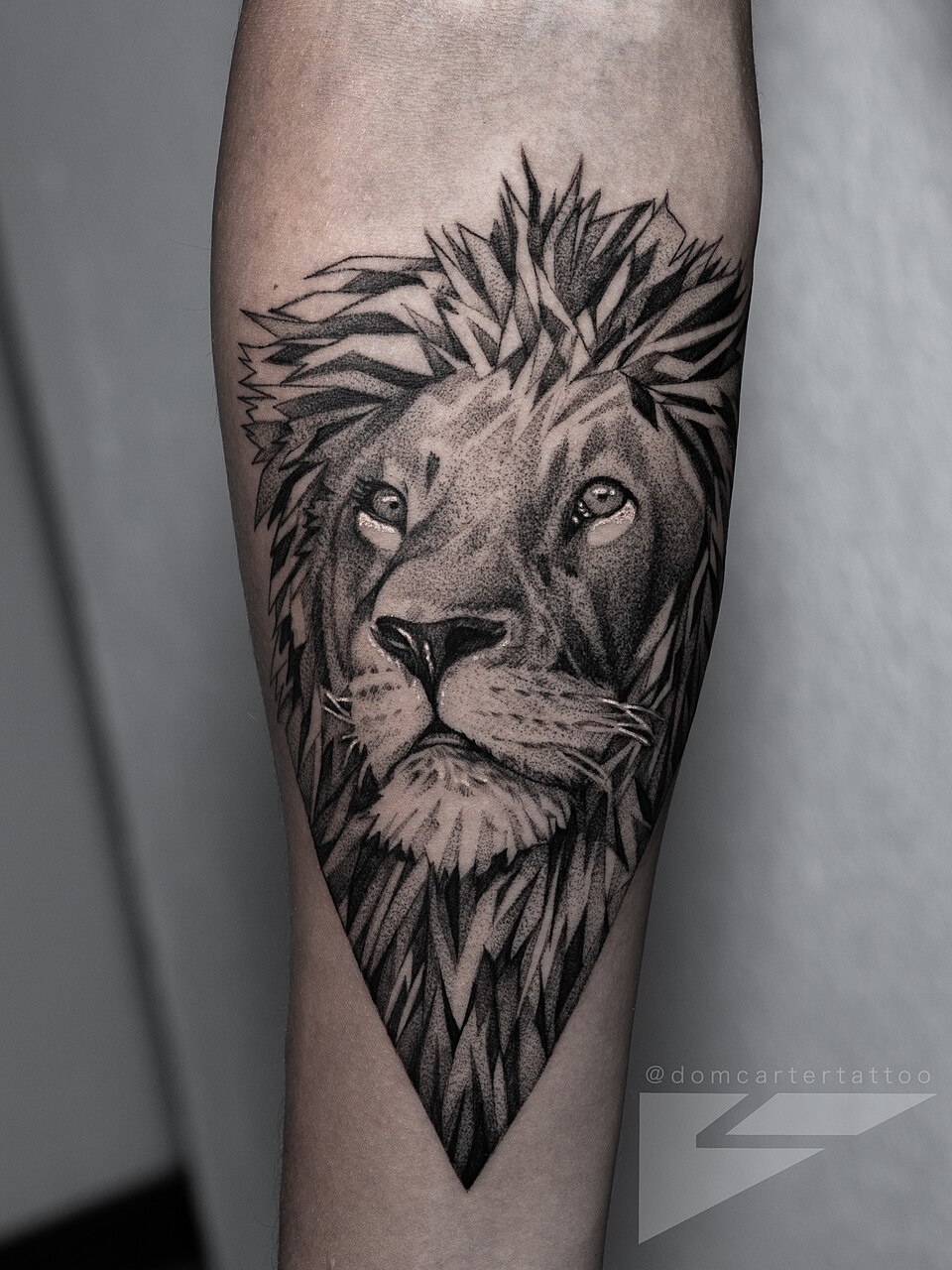
Dom Carter’s lion at the top of this article lets the eye follow the outline without a competing background. That is a useful goal for your first photograph: make the complete piece readable. When publishing your own work, also state whether it is fresh or healed; an attractive image does not replace that information.
Sources and editorial notes
- Nikon · Setting White Balance
- Nikon · Polarizing Filters Add POW to Pictures
- Tattoo: Mattia Jey, Horror Vacui; foto / photo: Giovanni Da Rin Betta · CC BY-SA 4.0
- Fotografía / Photo: Tony Alter; tattoo: Josh Shortridge · CC BY 2.0
- Dom Carter · CC BY-SA 4.0
- Dom Carter · CC BY-SA 4.0
Manufacturer and organiser facts are linked above. Our selection and reading advice expresses TattooXpert’s editorial judgement.
Our editorial methodFROM THE PAGE
TO YOUR STUDIO.

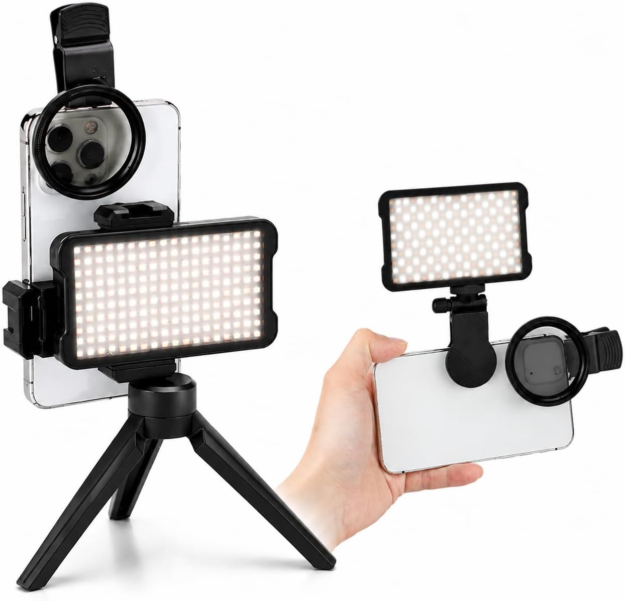
A rechargeable light marketed for tattoo photography.
KEEP EXPLORING.
Saving a thousand tattoos will not teach you to draw: build a useful reference library
A useful archive is more than an endless folder of screenshots. It is a collection of questions, sources and observations you can turn into your own drawing decisions.
TattoXpert
Neotraditional tattooing: beyond pretty flowers and bold colour
Learning to draw neotraditional designs starts with more than choosing a subject. Explore its influences, study real artwork and try an exercise in line, hierarchy and colour.
TattoXpert