
Tattoo lettering: give a word a voice of its own
From calligraphic movement to abstraction: learn to look at letters, spacing and flourishes before drawing a tattoo phrase. With real images and a practical exercise on paper.
The word stays the same; its expression can change
Write “alma” in your sketchbook—the Spanish word for soul. Make it narrow and upright. Then try a slanted version in which one letter seems to lead into the next. Its meaning remains, but the feeling changes. That is a useful starting point for tattoo lettering: deciding what you want a word to do when someone looks at it.
Before adding a large flourish, there is a quieter problem to solve: how the four letters work together.
Drawing a word creates room for individual decisions
Google Fonts distinguishes lettering, which draws letterforms for a particular use, from calligraphy, which forms them through writing. Typography works with characters from a typeface, even when alternate forms imitate a handmade appearance. These related processes allow different results.
Flourishes have a history worth exploring
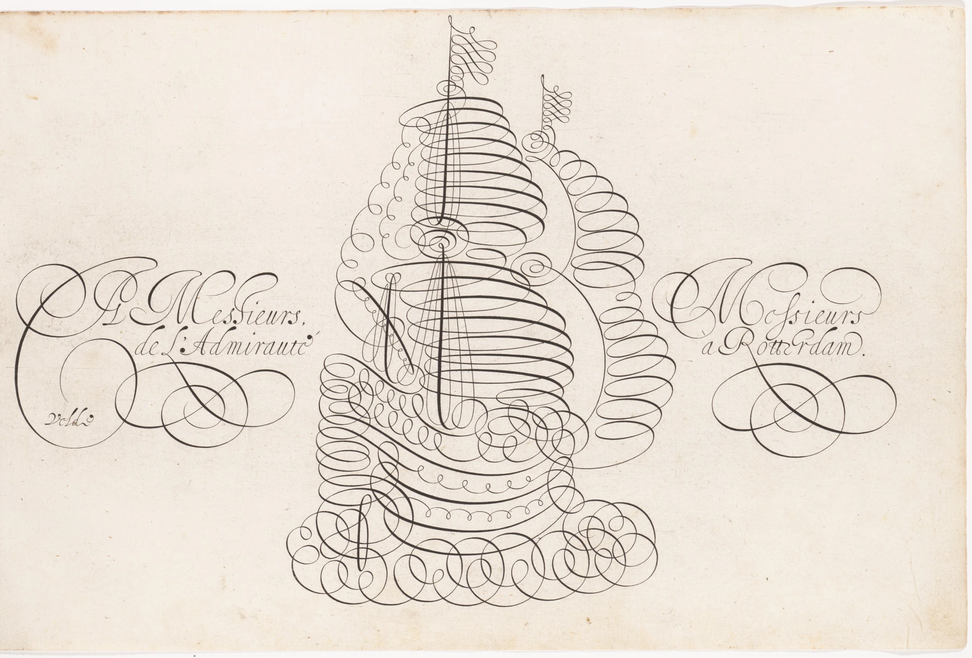
The cover plate comes from Jan van de Velde I’s Spieghel der Schryfkonste, published in 1605 and held by the Met. Cooper Hewitt explains that his flourishes could extend writing into figures and ornamental designs.
It is a historical example of the relationship between letters and images. It does not establish a direct line of influence on every contemporary tattoo style.
Look for the point where a letter becomes a drawing
In the plate, loops form a ship while words sit on either side. Follow a stroke with your eye without trying to read the entire text. Then return to the letters: what makes them recognisable, and what turns a line into ornament?
Take that question into your sketches. An extension might support the word, balance a corner or compete for attention. Give it a purpose before using it to fill an empty space.
Lettering includes different approaches
Publisher Thames & Hudson presents BJ Betts and Nicholas Schonberger’s The Graphic Art of Tattoo Lettering as an exploration of different schools, artists and ways of drawing letters for tattoos. That variety matters: no single alphabet can stand for all tattoo lettering.
Names deserve care too. Google Fonts places Fraktur within the blackletter family alongside other forms; the two terms are not fully interchangeable.
When shape matters more than reading
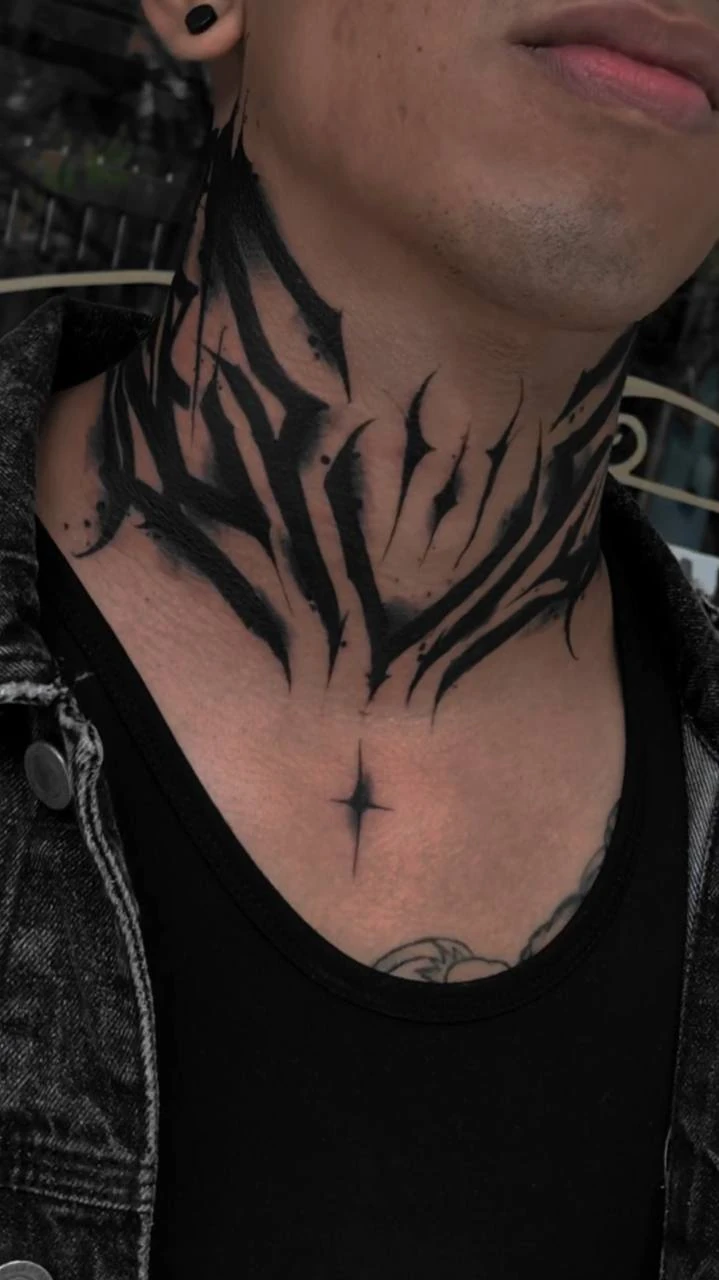
Decide how immediately it should read
The abstract piece suggests a useful choice for your sketchbook: should someone read a word immediately, or notice a composition first? Those intentions lead to different questions.
If you are designing a name that needs to be recognised, check whether decoration makes one letter resemble another. If you are exploring abstraction, make that aim clear. Start with a readable version before distorting it, so you have a reference against which to judge each change.
Space belongs to the letter too
In typographic terminology, a counter is the space inside a letterform. It can be closed, as in an “o”, or open, as in a “c”. Looking at those spaces gives you more to examine than the black outline alone.
A four-letter exercise
Work on paper with a word of your own, or use “alma”. This exercise explores composition; a final design for the body needs to be reviewed with the tattoo artist.
- Draw a simple first version and preserve the spaces inside its letters.
- Make another version with different widths or slant, leaving decoration aside for now.
- Check the spaces between letters in pairs: al, lm and ma.
- Add one flourish, then compare how well it supports your intention.
- View both versions at the size you are exploring and ask someone to read the word without prompting.
- Check spelling, accents and meaning before preparing the final version.
The next step can fit on one page
Keep the sketches together. Mark which version best expresses your idea and which letter still needs work. Your next drawing session can focus on that particular connection, without rebuilding an entire alphabet.
A word with character grows from decisions you can explain: rhythm, space, contrast and an intention that remains visible after you put the pencil down.
Sources and editorial notes
- Google Fonts Knowledge · Lettering
- Google Fonts Knowledge · Calligraphy
- Google Fonts Knowledge · Blackletter
- Google Fonts Knowledge · Counter
- The Metropolitan Museum of Art · Spieghel der Schryfkonste, 1605
- Cooper Hewitt · Van de Velde’s Famous Flourishes
- Thames & Hudson · The Graphic Art of Tattoo Lettering
- MACABREINK · FreeHand Tattoo Lettering Abstracto
- Wikimedia Commons / The Met · DP161559, Open Access CC0
Manufacturer and organiser facts are linked above. Our selection and reading advice expresses TattooXpert’s editorial judgement.
Our editorial methodKEEP EXPLORING.
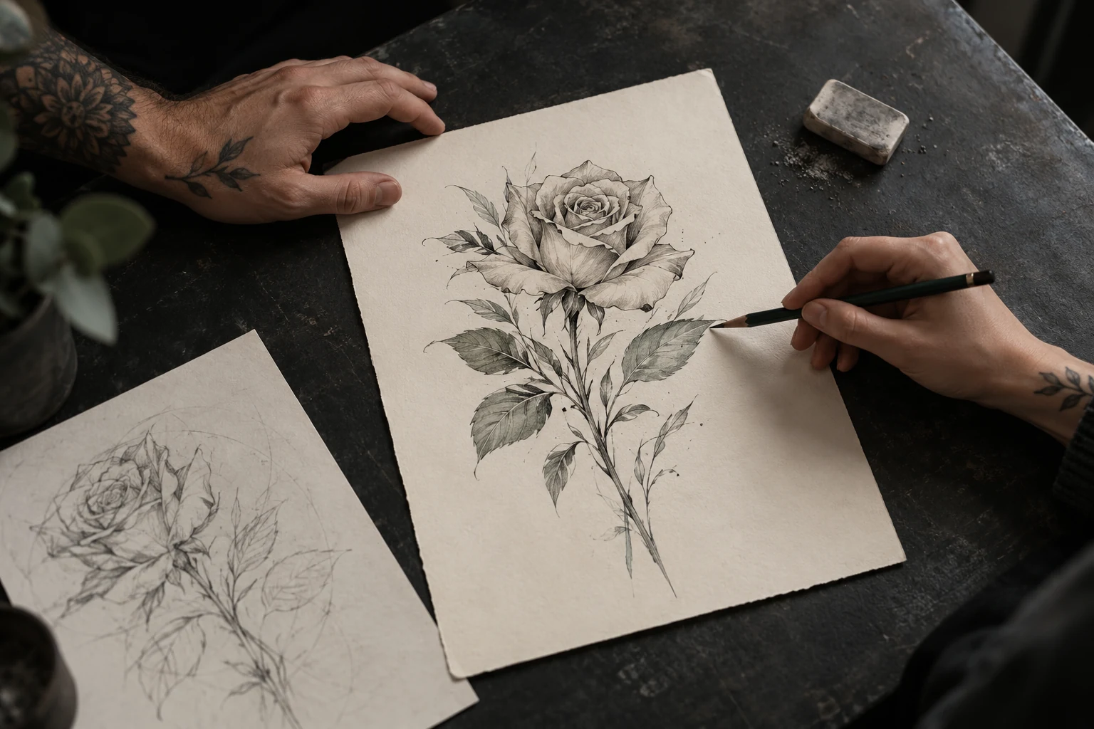
Beyond “looks good”: how to ask for feedback that improves your drawings
Specific questions, a rose in three variations and a short exercise for using critique without losing your own intention. A practical guide for people learning to draw for tattooing.
TattoXpert
Your first tattoo apprenticeship portfolio: what to show while you are still learning
Choose your drawings, show their development and prepare a clear introduction to a studio. A beginner's guide without inflated experience or pages added just to fill space.
TattoXpert