
Dotwork tattoos: look beyond the dots to understand the shading
Understand dotwork shading, its relationship with blackwork and geometry, and what to study in real tattoo photographs. A paper exercise turns those observations into drawing practice.
What is dotwork, and what should you look at first?
Zoom into a tattoo photograph and a shaded area suddenly resolves into hundreds of dots. That shift in scale offers a useful introduction to dotwork: dots build tone and texture rather than merely decorating a surface. Their density helps create transitions between light and dark. Milly Tattoo describes this approach in its introduction to the style.
If you are learning to draw for tattooing, start with a different question from “how many dots are there?” Ask what the shading contributes to the design. It might separate two petals, suggest a rounded surface or leave a clear edge. Understanding that purpose gives you something specific to study. You can begin with paper: this guide looks at images and offers a drawing exercise, rather than instructions for performing a technique on skin.
Dotwork vs blackwork: separate the marks from the motif
On his own website, Jeanmarco describes dotwork involving mandalas and patterns alongside continuous black lines. His explanation challenges an overly strict definition: a piece can include an unbroken outline and still use dotted shading.
When sorting references, try asking three separate questions. What marks create the shading? What role does black play across the piece? How is the subject organised? Dotwork directs your attention towards the first question; blackwork towards the role of black; “geometric” describes the structure of a design. These are useful ways to read an image, rather than mutually exclusive boxes.
Imagine drawing a flower surrounded by triangles. You could shade its petals with dots, fill some triangles and leave others empty. The geometry does not determine the shading method. Keep that distinction in mind when collecting examples: a folder labelled “dotwork tattoos” can easily contain designs that have little in common beyond the presence of dots.
Read the mandala at two different scales
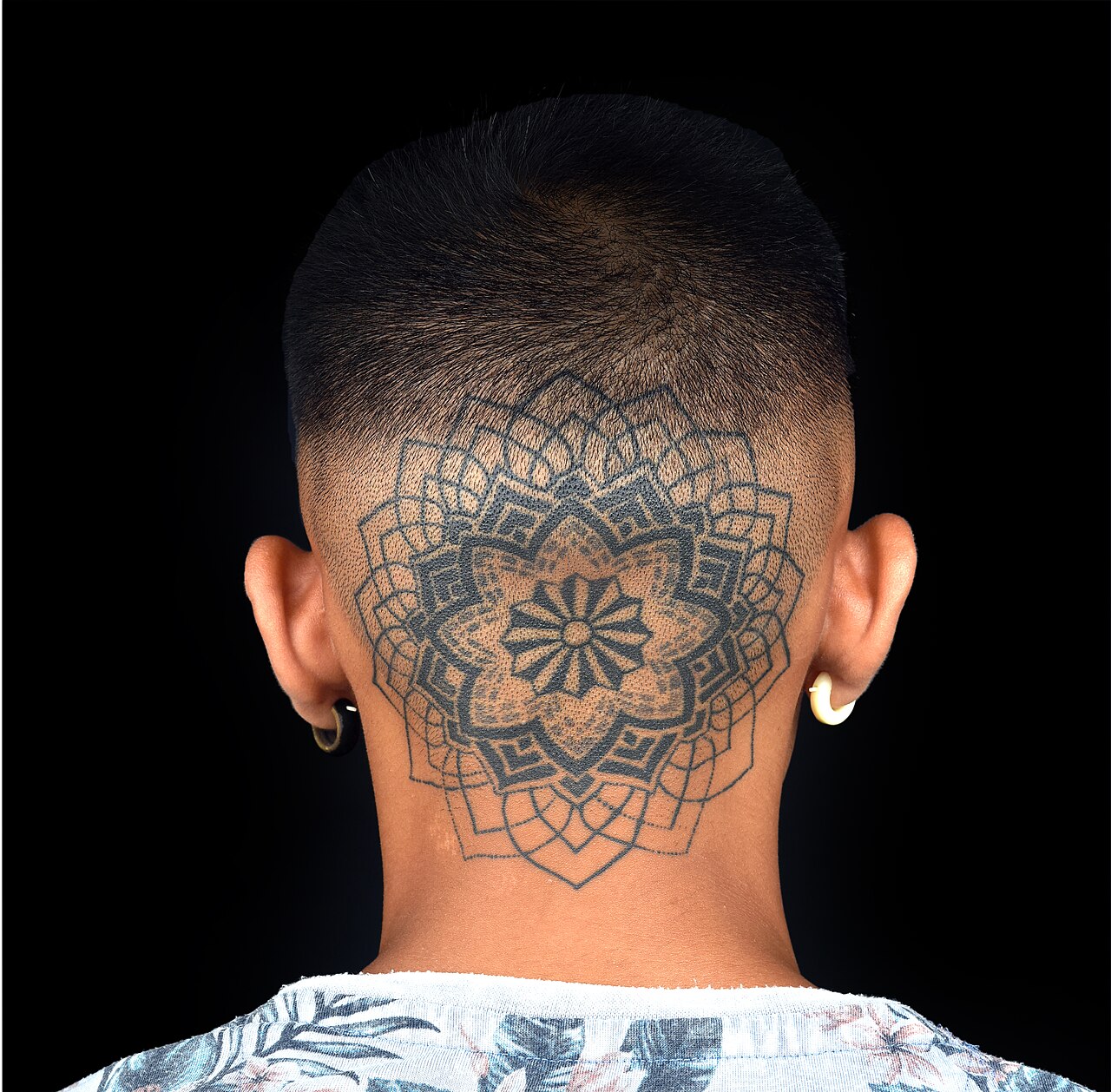
The cover photograph shows a mandala with a recognisable centre and repeating elements around it. Continuous outlines organise the design, while solid areas and dotted shading carry different visual weights. Visible skin remains between them.
Our suggested reading: look at the overall shape first, then examine the inside of a single petal. This lets you notice where detail gathers without losing the larger composition. The photograph supports that visual comparison; on its own, it cannot establish how the tattoo was made or how it developed over time.
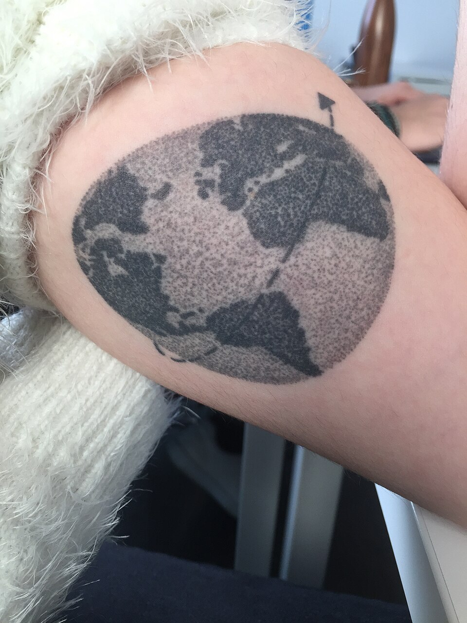
Dotted shading does not have to mean a mandala
Think about density, edges and the direction of light
In a sketch of your own, decide which area you want to keep light before filling it with marks. If every part receives equal attention, it becomes harder to explain why one area should draw the eye. Write “light” outside the outline and add an arrow pointing in your chosen direction. You do not need to attempt a perfectly shaded sphere: an invented folded leaf gives you a crease to interpret.
Next, decide how the shadow should end. An abrupt boundary offers a different reading from a gradual transition. Try both in small studies and ask which helps explain the fold. The aim is not to produce an attractive gradient in isolation. It is to give that gradient a job within the drawing.
Finally, reserve an area without marks. Doing so makes you compare what you add with what you leave visible. Instead of automatically correcting every gap, ask whether the composition needs that opening. Treat this as a way to explore a paper drawing, not a universal formula for every tattoo. You can change the decision once you have seen what it does.
A paper example of changing mark density
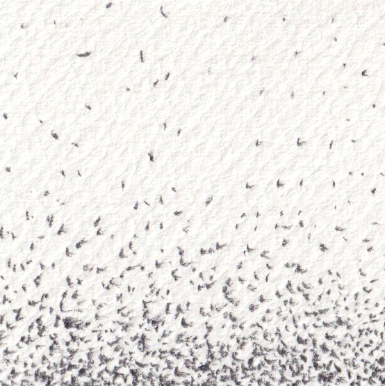
A stippling exercise: one fold, two choices
Make two small rectangles of equal size and draw the same simple folded shape inside each. Keep the outline and the light direction consistent, so you can compare the shadows without changing the entire subject. Use a pencil or pen on paper and leave room underneath for a few notes. The comparison matters more than making either version ready for a portfolio.
- Start with three separate samples: light, medium and dark. Decide where each might belong in your shape.
- In the first rectangle, gather the darker shading beside the fold and gradually lighten it outwards.
- In the second, preserve more blank space and try a shorter transition. Avoid adding decoration to hide the difference.
- Step back, compare the versions and write down which explains the fold more clearly and why.
Review the drawing before adding more dots
Cover one version and look at the other by itself. Can you recognise the fold without someone pointing it out? Then show both to another person and ask which area looks lightest and which edge is hardest to understand. A specific response gives you a next experiment. “I like this one” is a valid preference, but it tells you less about the drawing.
If a transition looks like an abrupt step you did not intend, return to a small sample instead of filling the entire sketch. Test an intermediate area. If both versions remain confusing, reconsider the shape and the position of the light first. More dots are not the answer to every problem. Keep the unsuccessful version as well: comparing your own decisions helps reveal what you actually changed, rather than relying on a vague memory of the first attempt.
Build a reference collection you can learn from
When you next browse dotwork tattoos, save the source and the tattoo artist’s name when it is identified. Add one observation of your own: “shadow separating petals”, “background leaving a light edge” or “texture inside a figure”. If the tattoo artist is unknown, do not assume the person who uploaded the photograph created the tattoo.
Choose a visual decision, such as a tonal transition, and explore it in a subject you have drawn yourself. Studying a decision does not require reproducing somebody else’s whole composition. A useful session might finish with two modest sketches and a precise conclusion: where shading was needed, where it got in the way and what you want to test next. That gives your next drawing a purpose beyond simply filling a page with dots.
Sources and editorial notes
- Milly Tattoo · Dotwork Tattoo
- Jeanmarco · El arte de los tatuajes dotwork
- Inkindia · Dotwork Mandala Head Tattoo
- Leahuyghhhhhhh · Tatouage en dotwork
- FriedeWie · Punktschraffur
Manufacturer and organiser facts are linked above. Our selection and reading advice expresses TattooXpert’s editorial judgement.
Our editorial methodKEEP EXPLORING.

How to improve your tattoo drawings with useful feedback
Ask for useful feedback on tattoo drawings: focus the question, separate observation from taste and turn a comment into a test.
TattooXpert
Blackwork tattoos: why negative space matters as much as black ink
Explore blackwork through solid black and negative space, with real references and composition exercises for your sketchbook.
TattooXpert