
Watercolor tattoos: give the colour a shape before adding splashes
Learn to read watercolor tattoo designs through edges, contrast, colour and open space, with historical context, real images and a drawing exercise for beginners.

A wash of colour still needs structure
You see a flower dissolving into blue and pink and imagine that matching those colours must be the difficult part. First, there is another question: why can you still recognise the flower when some of its edges disappear? That is a useful starting point for studying watercolor tattoos.
The style creates a painterly appearance through colour transitions, patches and varied edges; black lines can be part of it. When drawing, first decide which shape needs to register and which areas can remain more open. Splashes come later. They cannot organise a composition on their own.
This guide is about looking and designing on paper. The aim is to help you explain what attracts you to a reference, compare alternatives and bring a considered drawing to a mentor. Even a successful study still needs professional adaptation before it becomes a tattoo.
A historical reference, rather than one neat origin story
MCA Denver documents Amanda Wachob's painterly tattoo work from 2008 and her 2019 exhibition Tattoo This. That gives us a specific artist to explore, without proving that an entire style has a single inventor.
When researching a movement, it is tempting to find one date and consider the history settled. Following particular works, artists and decisions is more rewarding. Does the image suggest a brush gesture? Does it combine a recognisable subject with an abstract area? Those questions let you learn from a piece without treating its maker's name as a universal formula. History also helps separate two things that share a word: painting a tattoo design in watercolour and tattooing a watercolour effect.
Watercolour on paper: a different use of colour
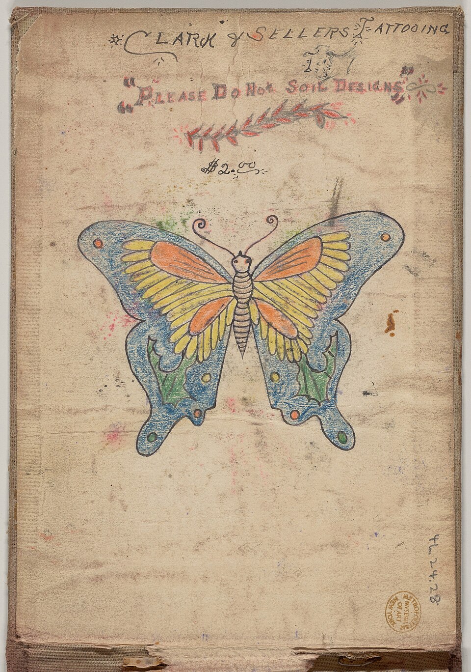
Edges: where a shape becomes recognisable
For your next sketch, choose something simple you have observed directly, such as a leaf. Draw one version with a continuous outline. In another, retain only the sections that help establish its direction and silhouette. For a third, try building it from two areas of colour.
Compare the three from the same distance. One open edge may feel expressive, while another removes something essential. There is no need to delete every line to satisfy a style label. What matters in this exercise is understanding the job each line does.
Mark the point where your eye first enters the image. If everything competes for attention, try simplifying the area around that point. This review cannot tell you which design would last longer on skin. It helps you understand what your drawing communicates now.
Three choices that change how a drawing reads
Use this comparison to review a sketch, rather than to divide tattoo styles into good and bad categories.
| What to check | Drawing choice | What to check |
|---|---|---|
| Continuous outline | Defines the subject all the way around. | Does colour have a role of its own, or does it simply fill the interior? |
| Broken outline | Keeps some boundaries and opens others. | Can you follow the shape where a line stops? |
| Colour without a continuous outline | The silhouette depends on colour patches and their differences. | Can you recognise the main direction without adding more detail? |
Use a small palette to see your decisions clearly
For a paper study, limit your first attempt to two colours and an unpainted area. This is a learning constraint, not a rule of the style. Starting with eight colours makes it harder to identify which change actually improved the image.
Imagine a blue leaf with an orange accent near its stem. Make another version with that accent moved to the tip. Keep everything else: size, silhouette and background. Compare where your eye pauses. You have tested a specific decision, instead of adding colours until the page feels finished.
Save a greyscale version of a digital drawing, or simply compare the light and dark areas by eye. Treat it as an additional check. A paper or screen experiment cannot predict the appearance of the design on a particular person's skin.
Look at the whole piece before zooming in
The cover photograph, taken by Maxim Krayushkin in 2017, shows a small circular tattoo in relation to the person's back. Dark lines and softer colour areas are visible. We do not know who made the tattoo or how old it was.
That wider view raises a useful question: how does the design relate to the space it occupies? You can look for details afterwards, but a tightly cropped texture tells a different story. When saving references, note whether you are seeing the complete piece or only an area that interests you.
Avoid guessing an ink formula, machine setting or specific tattooing method from a photograph. The visible information lets you discuss the image. Anything undocumented should become a question rather than an assertion.
What a portfolio can tell you about time
Laura Caselles publishes watercolor examples with years of development identified in their captions. These are individual cases documented by the artist, not a guarantee for every piece.
If you want to compare photographs, make a short record: the tattoo's date, the photograph's date and whether a touch-up is recorded. Leave anything you cannot confirm blank. A visual resemblance cannot fill those gaps for you.
When speaking with a professional, ask about examples related to the scale and kind of composition you are studying. A recent image and an older one can start a useful conversation. They cannot establish that your future work will develop in exactly the same way.
An exercise that leaves you with more than a pretty sheet
Set aside a drawing session to compare choices. Work only on paper or in an illustration app. These studies are not instructions for practising on people.
- Observe a leaf, flower or another object of your own and draw its main shape. Avoid tracing someone else's tattoo for this exercise.
- Repeat the subject three times at the same size. Change only the relationship between line and colour, keeping the starting subject recognisable.
- Choose two colours. In each version, decide where to place the accent and which space to leave unpainted. Explain that choice in one sentence.
- Step back from the sheet, then look closely again. Record what reads first, which part gets lost and which detail you could remove.
- Present the versions together and request specific feedback: which edge clarifies the subject, or which colour patch pulls attention away? Keep your first version to compare with the next attempt.
The next equipment purchase can wait
If you cannot yet explain why you placed a patch of colour in that spot, changing machines will not answer that composition question. Start with the drawing and a focused review with someone who can guide you.
By the end, you should be able to identify a main shape, explain your use of line and justify a colour decision. That vocabulary will help you read references more critically and have better conversations about your work. Then bring the splashes back: you will have a reason for putting them where they are.
Sources and editorial notes
- Esneca · Tatuaggio watercolor
- MCA Denver · Amanda Wachob: Tattoo This
- The Met · Clark & Sellers, 46.24.28(1)
- Maxim Krayushkin · DSC07526.jpg
- Laura Caselles · Acuarela
- Wikimedia Commons · The Met image and CC0 permission
Manufacturer and organiser facts are linked above. Our selection and reading advice expresses TattooXpert’s editorial judgement.
Our editorial methodKEEP EXPLORING.
Tattoo apprenticeship portfolio: what to include and how to arrange it
Build a tattoo apprenticeship portfolio: select your drawings, show your process and arrange the pages before approaching a studio.
TattooXpert
Neo traditional tattoos: how to recognise the style
Explore neo traditional tattoos, their relationship with traditional work, and what to look for in line, colour and composition.
TattooXpert